Can you read me now?
Text and imagery have had an uneasy relationship since the day they met. Satellite imagery and aerial photographs are the ultimate variable background, which makes any text drawn on them hard to read.
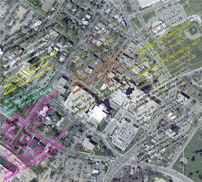
There are plenty of options in ArcMap for displaying text, ranging from changing the style, size, and color of text to adding effects like drop-shadows and halos. Some of these options will work better than others for individual cases, and combinations of these options can work quite well in many cases. The image below contains quite a few possibilities, some are intended to illustrate viable solutions, while others are just there to show failed strategies.
These examples are mostly graphic text elements added using the Draw toolbar. Besides changing the size and style of the text, a drop shadow effect is used on the text in the second column. The drop shadow was set up with a 0.4 point shift in the X direction, and a -0.4 point shift in the Y direction. Those shift directions match the direction of drop shadows in Windows and match most people's expectations for drop shadow direction. The text in upper portion of the third column have a halo size of 0.6 points. To learn how to set up these effects see the ArcGIS help topic about Creating text symbols.
The four groups at the lower right are annotation features, and the highlighting shows different kinds of masks created by the Feature outline mask tool, which can use annotation as input data. The Feature outline mask tool is only available with an ArcInfo License. I set the masks to have between 50% and 75% transparency; this depended on how large the overrun the mask represented; if it was larger, I used a higher percentage of transparency. If you want to try any of these symbols, I exported my map's style (Tools menu -> Styles -> Export Map Styles) and you can download it.

The above examples are simple, i.e., horizontal text, rather than text at an angle or text on a curved baseline. Here is how diagonal text (30 degree angle) appears.
So far I've just shown what you can do to the text, you can also subtly change how the image is displayed. For instance by setting the properties for contrast to -20, and brightness to 20, the imagery can be 'pushed' to the background without compromising the detail of the imagery.
The contrast and brightness settings are available in two locations: the first is on the display tab of the layer properties dialog, and the second is on the Effects toolbar. By the way, this is also a good trick to know if you're printing imagery on relatively inexpensive paper and don't want to over-saturate the paper with ink.
The idea is that you should evaluate what will work best for your purposes and use that approach. No single strategy will work best in all cases. If I'm pressed for a quick answer, I usually say use a yellow or white drop shadow on black text. The reason is that it's fast to set up and it will make more text appear legible, while obscuring the least amount of imagery. A potentially better solution is to use annotation, but that requires more time to create, and to create the masks. Also, drawing the transparent masks adds a little to drawing time.


Ingen kommentarer:
Send en kommentar