I mit tegne/billebehandlingsprogram har jeg en menu som hedder 'distort' - Kartogrammer er en avanceret måde at definere en forvridning af den fysiske repræsentation af virkeligheden. Nogen gange informative andre gange forvirrende, men flotte det er de.
/Sik

In Photoshop there a menu called 'distortion' - cartograms are advanced methods to distirt the physical representation of the real world. Some times informative, some times bewildering but mostly fantastic looking.
/Sik
Quote
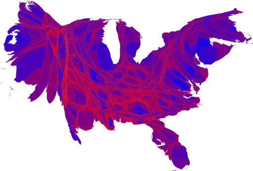
And here's what the cartogram looks like:

As this map makes clear, large portions of the country are quite evenly divided, appearing in various shades of purple, although a number of strongly Democratic (blue) areas are visible too, mostly in the larger cities. There are also some strongly Republican areas, but most of them have relatively small populations and hence appear quite small on this map.
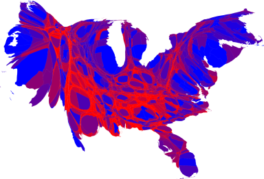
A slight variation on the same idea is to use a nonlinear color scale like this:


These maps use a color scale that ranges from red for 70% Republican or more, to blue for 70% Democrat or more. This is sort of practical, since there aren't many counties outside that range anyway, but to some extent it also obscures the true balance of red and blue. [...]
Read more: http://www-personal.umich.edu/~mejn/election/2008/
Ingen kommentarer:
Send en kommentar