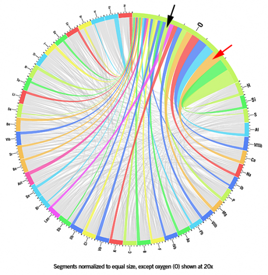
Ligesom GIS er ment som og som til tider faktisk også er en visuel og kreativ måde at vise store mængder af data er denne omsætning af tabulære data en genial måde at gøre kedelige tal til noget som kunne ligne kunst ... og så kan det faktisk bruges til noget ... Hvilken farve skal dine budgettal have?
/Sik

Like GIS is meant as a tool for creating vizualizing vast amounts of data this simple tool is great for transforming tabular data into stunning (and useable) art like figures. Brilliant and useful ... What colors should you use in your next budget?
/Sik
Quote
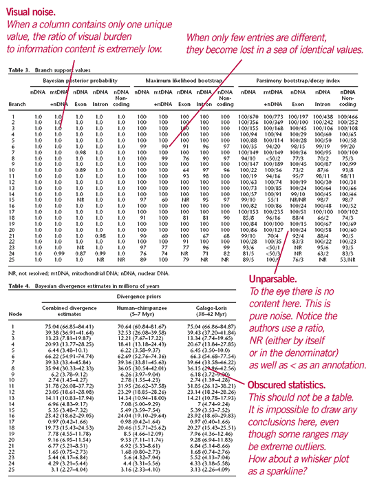
Suppose that you are reading an article and the text refers you to a table on the next page. Before you turn the page, what are your expectations of the table? Chances are, you would like it to communicate trends and patterns. Chances are, too, that it will fail and simply deliver numerical minutiae. You are left hunting around the numbers for a while, only to return to the text in hopes that the table's data trends will be communicated elsewhere.
Imagine if, instead, the table were replaced by a visual representation that was agnostic to the data domain, sufficiently quantitative to identify patterns and descriptive statistics, and made no assumptions about the kind of patterns that might exist. In this article, I outline one such representation. [...]

This is a guest post by Martin Krzywinski who develops Circos, a GPL-licensed (free) visualization tool that can help you show relationships in data. This article is based on a longer writeup which you can find here.
Read more: http://flowingdata.com/2009/04/21/visual-representation-of-tabular-information-how-to-fix-the-uncommunicative-table/

Ingen kommentarer:
Send en kommentar